How to design a Product Hunt gallery.
Give your launch images a clear sequence: introduce the product, show how it works, and make each feature easy to understand.
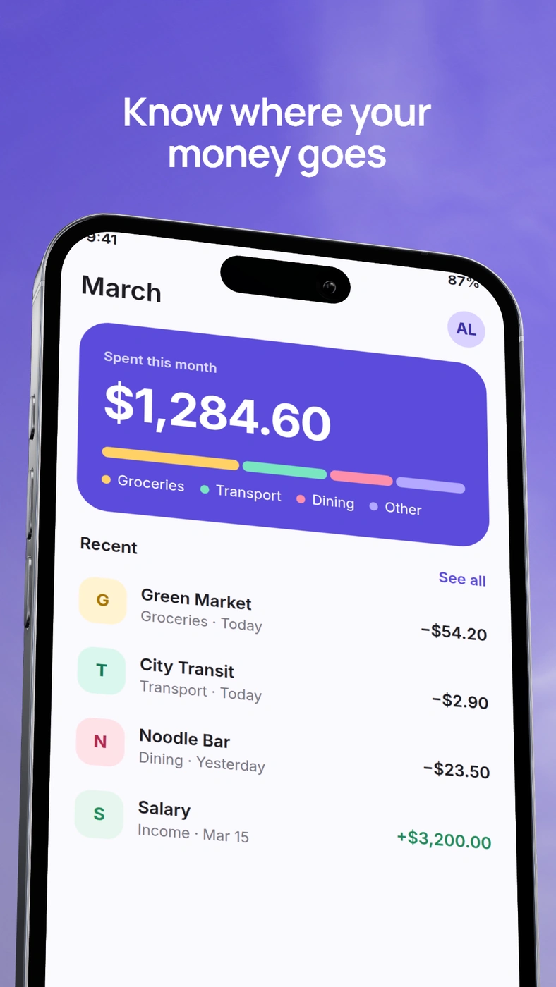
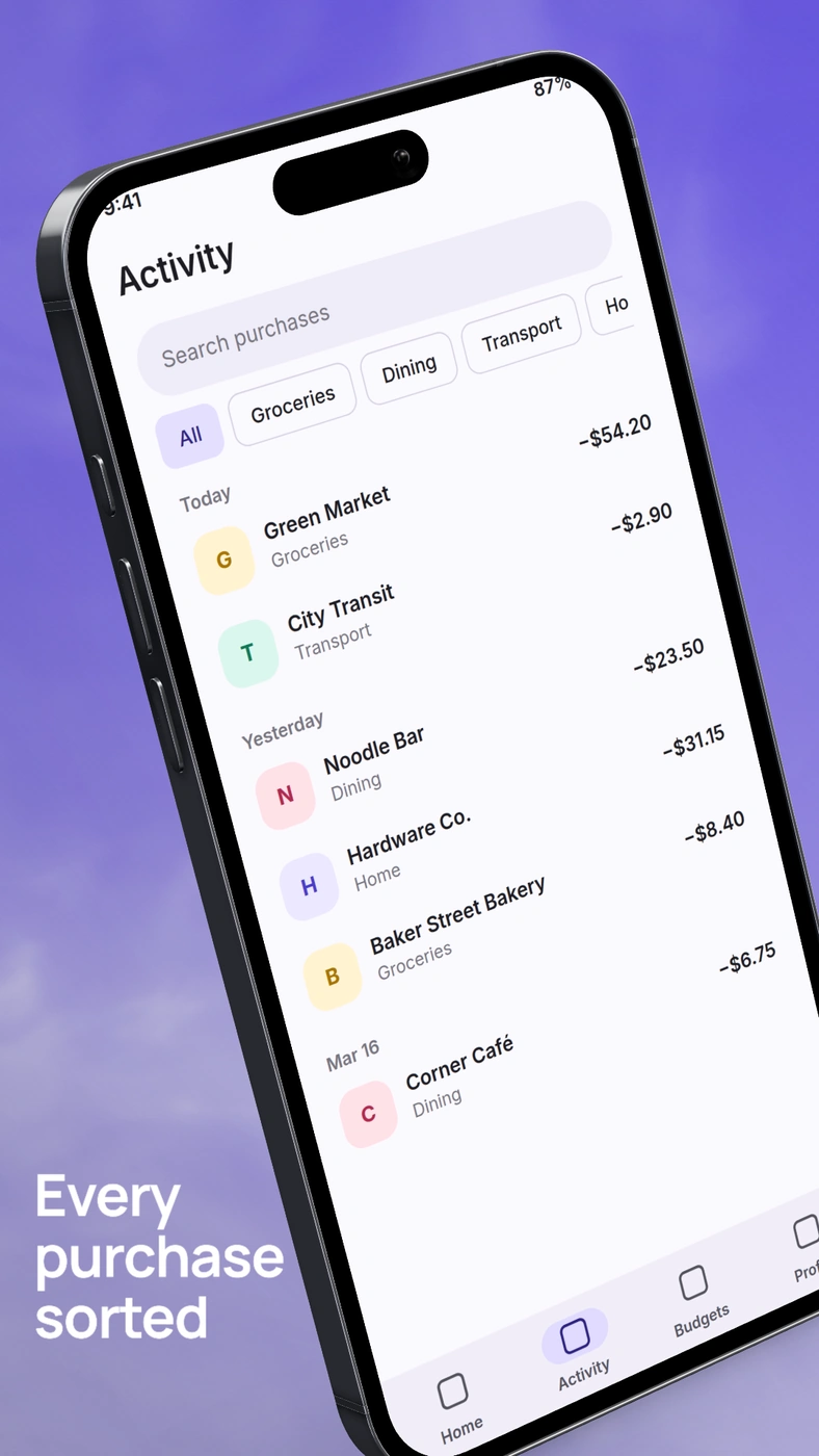
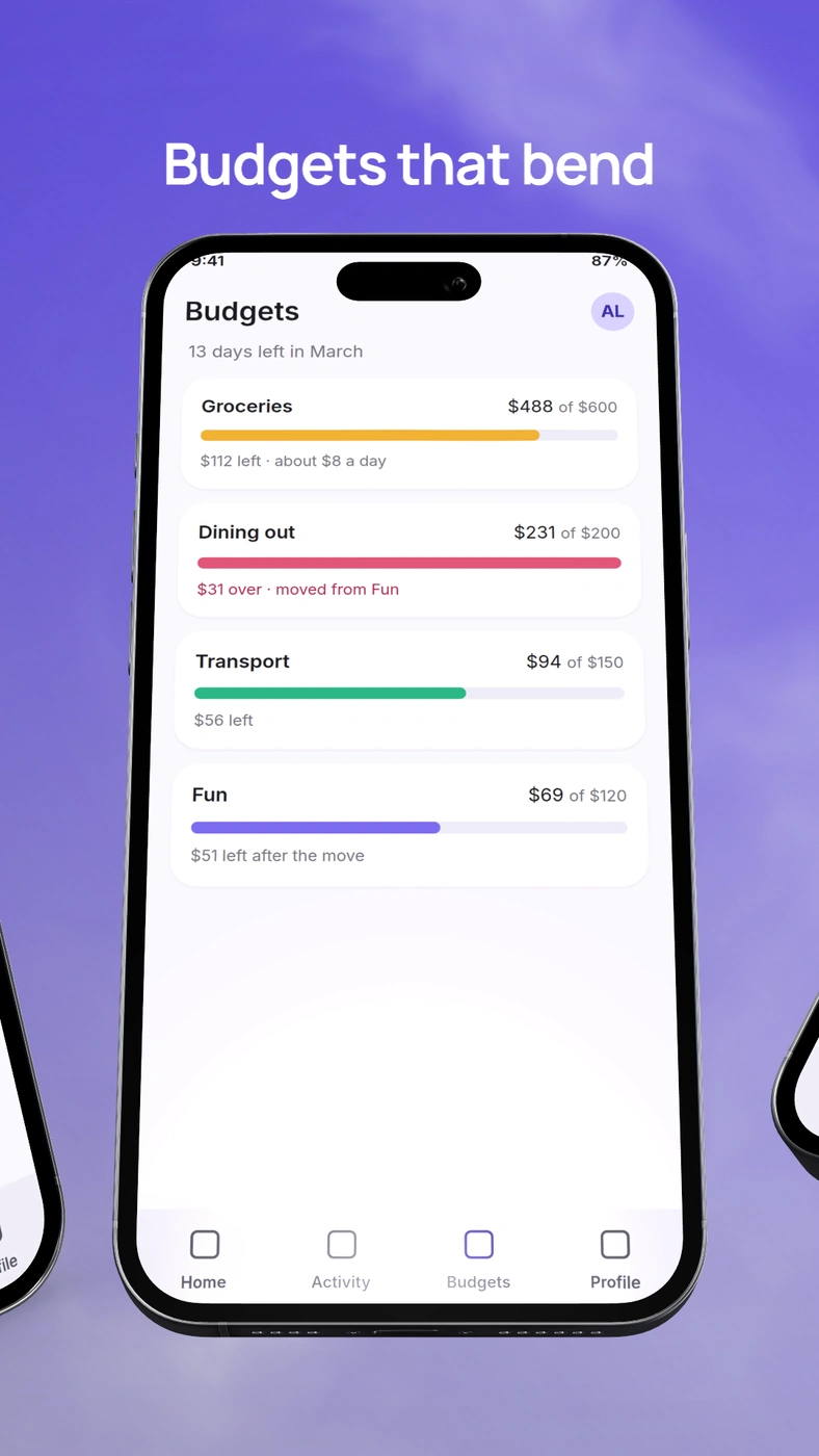
Plan a sequence people can follow.
Choose a small set of screens that answer different questions. A useful starting sequence is an overview, the core action, a meaningful detail, and the result. This is an editorial suggestion, not a required number of gallery images.
For a spending app, that could mean a monthly summary, a categorized purchase, a flexible budget, and a transaction export. Each image explains something new while the real interface provides evidence.
Write a one-line purpose for each image before opening the editor. If two images explain the same feature, combine them or show a different step. Do not fill the gallery simply because another screenshot is available.
Make the first image understandable on its own.
Start with the screen that best explains the product, paired with a direct headline. Show enough of the UI for people to recognize the kind of tool they are looking at. Avoid a device pose that makes the most important content too small to identify.
Keep the main message in a central, uncluttered area. Link previews and gallery thumbnails can show images at different sizes, so do not rely on tiny captions near the edges. Reduce the cover to a thumbnail and ask whether both the product and its purpose remain clear.
Use a statement your screenshot supports. “See your spending by category” is a concrete message for a category dashboard. Claims about saving money or being the best require evidence beyond the composition.
Use the next images to explain one feature each.
Give each image a distinct job. Show an action in one, its result in another, or a focused detail that is difficult to read in the overview. A crop can be more useful than placing an entire desktop screen into every slide.
Keep the original interface intact. If you enlarge a detail, make its relationship to the full screen clear. Avoid composing several unrelated UI fragments into something that looks like a screen the app does not actually have.
For mobile apps on a wide canvas, position the phone beside a short text block. For desktop apps, let the interface occupy more of the width. Recompose from the source screenshot rather than stretching a tall store image into a wide rectangle.
Connect the images without repeating the layout.
Choose a shared background family, text hierarchy, and frame treatment. Keep headline positions and margins related. You can alternate an overview with a closer crop while maintaining the same visual language.
Use contrast to guide attention. If the app is visually dense, give it a quieter background. If the screen is sparse, a stronger background can frame it without competing with the content. Keep decorative effects subordinate to the screenshot.
For text, use short, specific headlines and optional supporting copy. Read thescreenshot typography guidefor line breaks, hierarchy, and thumbnail checks.
Review the gallery as a whole.
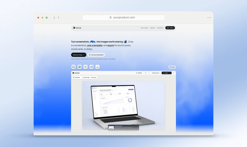
DeioLab’sProduct Hunt image makeruses a 1270 × 760 canvas. Open the full editor for additional composition controls and coordinated sets. Check Product Hunt’s current uploader guidance when preparing your submission.
- Review the sequence in order, then look at each image alone.
- Inspect both thumbnail size and full size for readable UI and copy.
- Check crops, margins, and the consistency of background and device styling.
- Export the final files and inspect them before uploading.
Your website’s link preview is a separate deliverable. Use theOpen Graph image generatorto recompose the cover at 1200 × 630 rather than stretching the gallery export.